Guide de l'application
Bienvenue dans le guide de l'application. Recherchez dans le menu de droite ou en tapant dans la zone de recherche. Si vous ne trouvez pas ce dont vous avez besoin, Contactez-nous.
11.2 Data analysis
In the “Data analysis” section of the menu, it is possible to display graphs relating to elements in the software.
General
In the General section, there are the total numbers, divided into specifications, of the elements:
- Interventions
- Customers
- Contracts
- Technicians
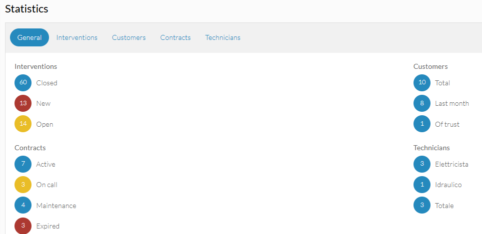
Clicking on each option will display the respective section.
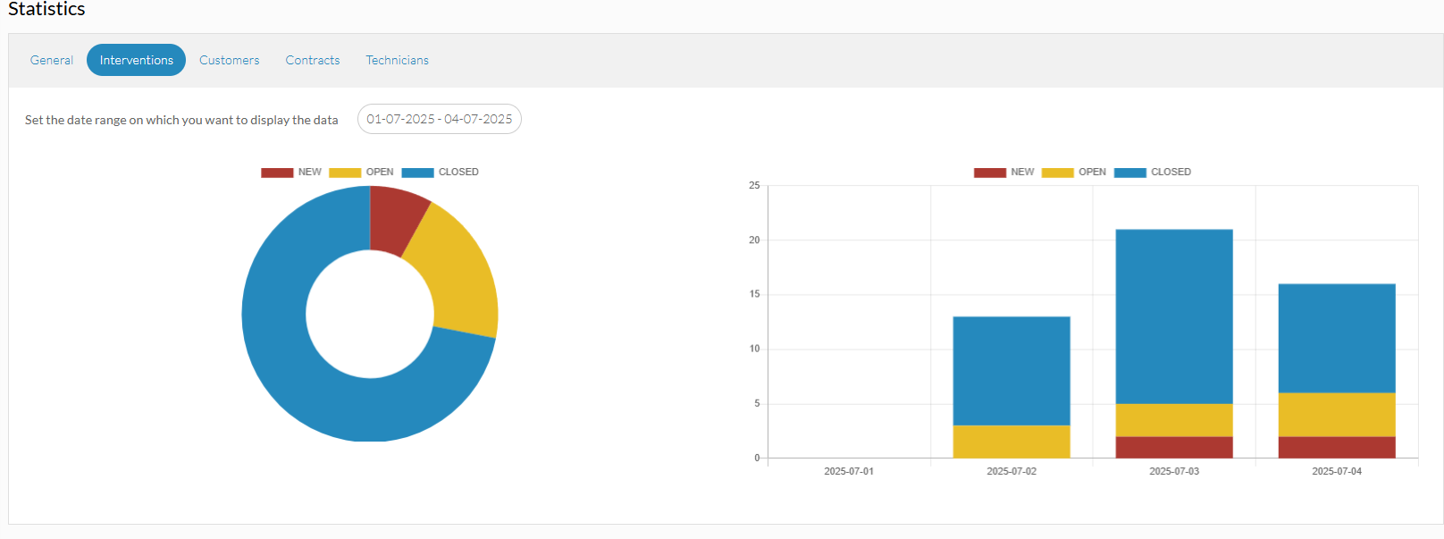
Interventions
If you go to the INTERVENTIONS tab, you will see a pie chart. The graph contains the intervention data, according to the different status: new, open and closed. The data are calculated on the basis of the time selected, in the space allocated. A histogram with the division into months and days can be displayed alongside.
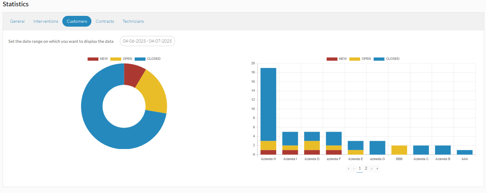
Customers
If the CUSTOMERS tab is opened, you will see a pie chart. The graph contains data on the sum of the interventions, according to the different status: new, open and closed. Data are calculated on the basis of the time selected. A histogram with the division according to the relevant customers can be displayed next to it.
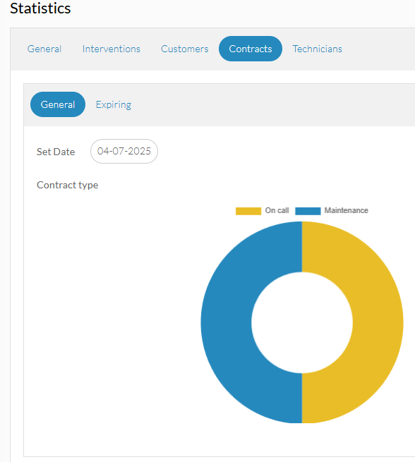
Contracts
By opening the CONTRACTS section, two Data Analysis sections can be displayed:
- General, presents a pie chart showing the total number of active contracts, both maintenance and on-call, according to the selected date.
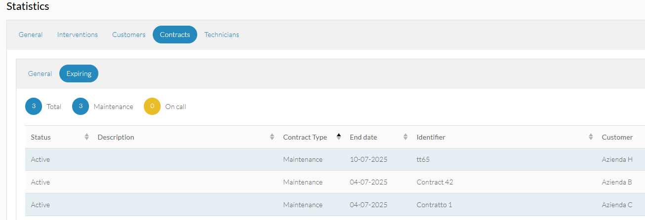
- Expiring, the total number of expiring contracts is entered. The expiry is identified according to what is set within the contract settings. In this tab, clicking on the totals will display the numbers of expiring contracts. Clicking on the type of contract, on the other hand, will show the list of contracts that are expiring either ON-CALL or MAINTENANCE.
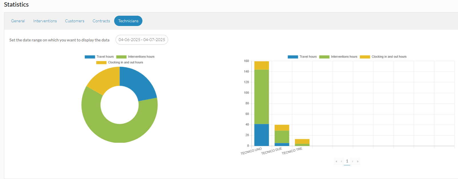
Technicians
In the TECHNICIANS section, there is a pie chart showing the data of the technicians according to the selected period:
- sum of the hours according to the clocking in and out
- intervention hours
- travel hours
The pie chart shows the total numbers for all technicians. In the histogram opposite, you can see the same data but broken down by technician.